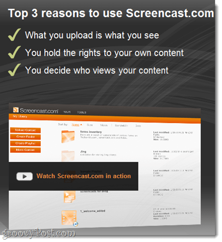
For those of you who missed our first review, however, Screencast.com is a photo and video sharing service that integrates very nicely into TechSmith products, but it also allows you to upload and share content from other programs as well. What we really liked about Screencast.com, when compared to sites like YouTube and Vimeo, is that the service is very good about keeping their paws off your stuff. Before you sign up, they promise:
What you upload is what you see (Screencast.com does not convert or re-encode your videos)You hold the rights to your content (big contrast to YouTube/Google’s terms of service)You decide who views your content
You can share Screencast.com content via links or with an embedded player like we did below. One thing I like about Screencast.com’s embedded player is its simplicity. Plus, Screencast.com / Techsmith doesn’t try to make a buck off your content IE: no off-the-wall suggested videos or ads. Heck, there isn’t even a logo or link back to Screencast.com! The free version of Screencast.com allows you to upload 2 GB of data with a 2 GB allotment for bandwidth. You can go pro for $9.95/month and get 25 GB of storage and 200 GB of monthly bandwidth. The professional-looking embedded player, the groovy terms of service, and the easy integration with our favorite TechSmith applications are all fairly compelling reasons to give Screencast.com a try. But the new Screencast.com beta is offering even further improvements. The Screencast.com Beta is a major overhaul of the Screencast.com web interface. Here are some of the highlights:
New Screencast.com Beta Screenshot Tour
New Content Library
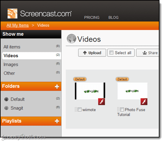
The current Screencast.com web interface is fine, but it’s not really cut out for organizing massive amounts of images and videos. And if you take as many screenshots/screencasts as we do here at groovyPost, then it’s only a matter of days before you have hundreds of files to keep track of. The new Screencast.com Beta uses a Library for viewing and organizing your content, and frankly, it’s a breath of fresh air. While folders always existed on Screencast.com, beyond that, navigating your content consisted of going through one giant list.
Folders and playlists now appear on the sidebar. You can also filter by content type by clicking Videos, Images or Other under the Show me section on the left-hand side.
Batch Editing
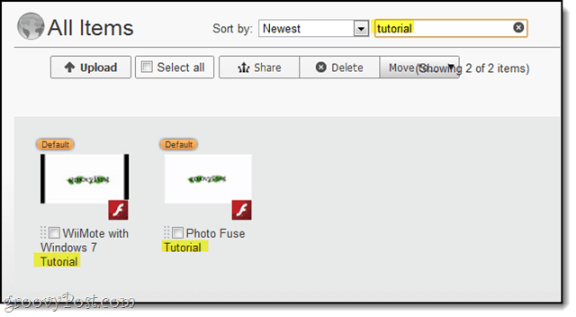
Along the top of each Library, view are editing actions that can be applied to one or more pieces of content. Simply check the box next to the item you want to edit and then choose an action. Great design and a big timesaver.
Searching
The new Screencast.com Library also has a search bar. You can search by keyword or string and sort by a number of criteria. In this screenshot, I’m getting hits from the video titles, but it also returns results from the tags, description, author, and other meta-data.
For example, here I get results because “Bluetooth” is in the keywords.
Info Tabs
Editing video and folder information is now done in a tabbed interface, rather than in a pop-up box. This is also where you choose privacy settings for folders. To edit folder information, navigate to a folder and Click the info icon.
This reveals the info tab. Make your changes and Click Save.
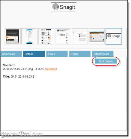
To edit individual pieces of content, Click them to view them and then scroll down to the info menus. This lets you preview what public viewers will see. To change items, Click the Details tab and choose Edit Details.
Sharing Multiple Images and Videos
When you select and share multiple items from your library, it gives you the option to Share Playlist. This is similar to creating a shared folder and is useful if you want to send a collection of slides to a user.
For example, here are the screenshots from this tutorial as a shared playlist. You can also embed them as a media roll.
Try the Screencast.com Beta
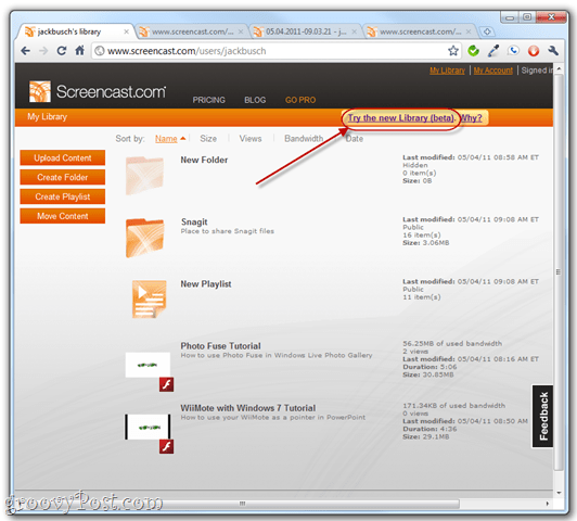
The public Screencast.com beta is 100% optional, and you can always switch back if you don’t like it. To access it, you will need an account so either log in or create a new account at Screencast.com and Click the Try the new Library (Beta) link in the top-right. To switch back, Click Leave the Library (beta) view. It really couldn’t get easier that.
Overall, being that Techsmith is one of my favorite software companies out there, my expectations were high when I started playing with this new beta. As you can tell from my overall review above, they didn’t disappoint and I look forward to the final release! Comment Name * Email *
Δ Save my name and email and send me emails as new comments are made to this post.
![]()

