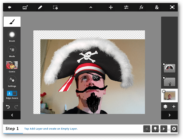
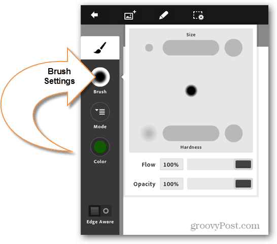
First off, the beloved brush tool is included. Being a longtime Photoshop user, this is the first tool I looked for. What I was initially hoping for was a makeshift replacement for my Wacom tablet desktop setup. Unfortunately, even with pencil-sized fingers it’s near impossible to accurately draw on such a small touchscreen. I tried it out with a soft-stylus and it worked better, but it definitely won’t be replacing my normal setup anytime soon. That said, the brush tool does have a limited selection of modes and effects that can be drawn on. Size and hardness are determined by dragging left or right, and flow and opacity can be customized too. I think Adobe did brilliantly here considering the hardware it had to work with.
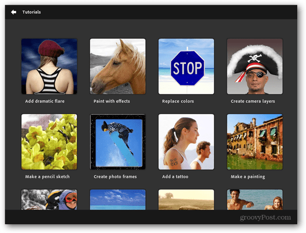
My favorite part of this app is the tutorials. Adobe definitely did great with these. The tutorials work for beginners and Photoshop professionals alike. They’re useful for helping get familiarized with the mobile interface. I completed all the tutorials before writing this review, and I’ll admit, I learned a couple of new tricks I’ll be porting over to the desktop version.
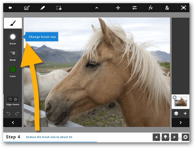
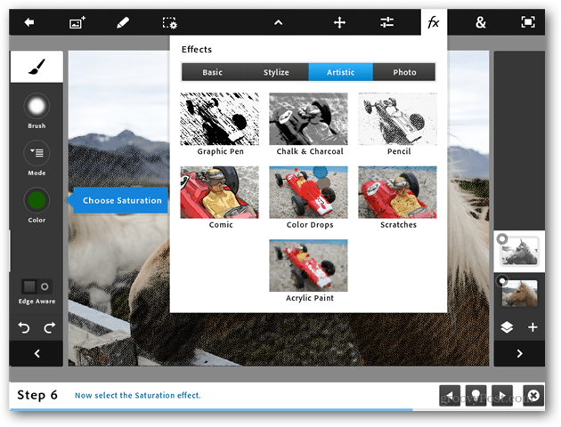
The tutorial guides are smart. Each step shows directions at the bottom, and then smart-tip dialogs display on the interface directly where the required tools are located. It also runs at your own pace and allows you to freely play, move back and forward, or dismiss the tutorial bar.
Moving on, one complaint I have is there is no Dropbox integration. Instead Adobe offers its own version vis cloud space with 2GB of free storage. Not bad but it will take some getting used to.
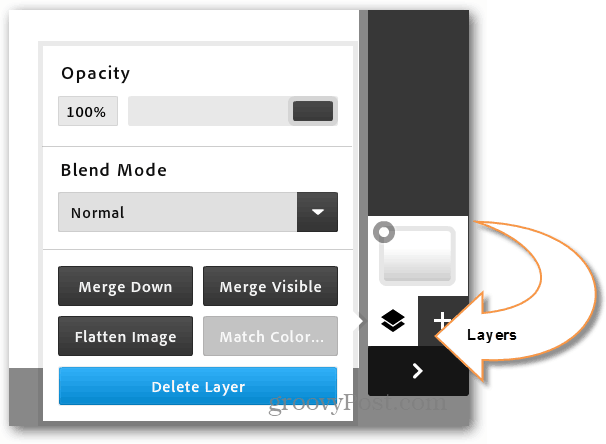
Conveniently you can log in to cloud space from anywhere from creative.adobe.com. Dropbox is still deeply rooted in most of my writing and photoshop workflows so like I said, it will take some getting used to. I thought the app was doing quite well with porting over to mobile and then I went to play with the layer styles — but there aren’t any. You can create blend layers, and that’s it. Needless to say, this is a big feature from the desktop version that I don’t think should have been left out, especially for a mobile platform.
Instead of filters, Photoshop Touch brings in the FX menu. There aren’t many to choose from, rather just the most popular ones. When you combine the effects with other tools found in the balancer and strangely labeled “&” menu, it does add more customizability. But, it’s still not enough to really be useful, and not intuitive enough for what it does have. Adjusting background colors should be a simple drag of a tool onto the photo, and applying filters discriminately. It shouldn’t require that I first meticulously select a region.
Another interesting feature of Adobe Photoshop Touch is searching Google for images and pulling them in to the app. Simply type in the type of image you’re looking for and select the type. Then you’re able to use the PS Touch tools to tweak the image.
Remember, many of the images you get from Google Image Search are copyright protected. To help you find images that you can reuse, click the Copyright button and search by usage rights.
It also lets you share your image creations on Facebook or email. You can view photos you’ve put on Facebook via PS Touch and your friend’s comments.
Conclusion
Photoshop for the iPad 2 and 3rd Gen is a good start to what may become the most useful mobile photo editing app available. Adobe has its work cut out if it however if it wants to gain a foothold on the mobile and tablet platform. Without an iPad compatible stylus, the brush tools are difficult, and the filters and balancers aren’t enough to compete with iPhoto, Filterstorm Pro, Photoforge 2 or Snapseed. Instead of focusing on mobility and user experience, it feels too much like Adobe is trying to port the most commonly used parts of the desktop suite over to a mobile app. A 10 inch tablet is never going to replace image editing on 28”+ desktop monitors, so I don’t need or expect my desktop Photoshop to run on it. I don’t think I’d pay $9.99 for it in its current state especially when you consider the other options available in the App Store. That said, I am eager to see the updates Adobe no doubt has planned for this app. There are 5 main changes I’d like to see in this app:
Removal of the 1600×1600 resolution limit. The native resolution on the iPad 3 is higher than this.Custom fonts, brushes, and textures.A revamped interface that makes it quicker swap between tools and colors.Integration with Dropbox.A more competitive price. At $10 Adobe is charging twice as much as competitors.
Have you tried Adobe Photoshop Touch for iPad or Android? Let me know your thoughts by leaving a comment below. If you’re a Photoshop enthusiast, check out our other How Tos, Tips and videos on Adobe Photoshop. Comment Name * Email *
Δ Save my name and email and send me emails as new comments are made to this post.
