Get Rid of Gmail Tabs
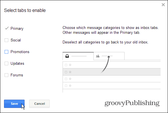
First of all, if you believe that the new Gmail tabs, which can be used to split your inbox into Primary, Social, Promotions, Updates and Forums, bring nothing useful to your Gmail account — get rid of them. While they are usually easy to manage, the trouble-causing Promotions tab. To get the old feel back, just nix them all. Check out Brian’s article on how to solve the tabs annoyance. Check it out here.
Make the Compose Window Big Again
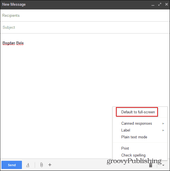
Google redesigned the Compose window completely about this time last year — wow, time flies!. Anyway, the new version has become standard for all Gmail users, meaning there’s no escaping it. Even though you can’t get rid of the new Compose box, you can at least get it to work in full-screen mode. That way, it’s closer to what it used to be. Start composing a message, then click the More options arrow at the bottom right corner and select Default to full-screen.
From then on, when you click to Compose a message, the window will stretch over a large portion of the screen – it may not be the old one, but it still is more comfortable.
More Compact, Old Colors
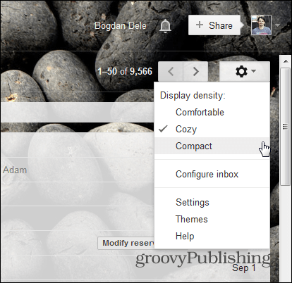
Miss that tight look that Gmail used to have in the old days? It’s still in there, you just have to enable it. Click Options (gears icon) on the top right side of the Gmail inbox and select Compact.
Now your messages will be shown closer together and closer to the old look. And speaking of the old look, if you go to Themes in the same menu and select High Contrast, I’m pretty sure that things will start to look more familiar.
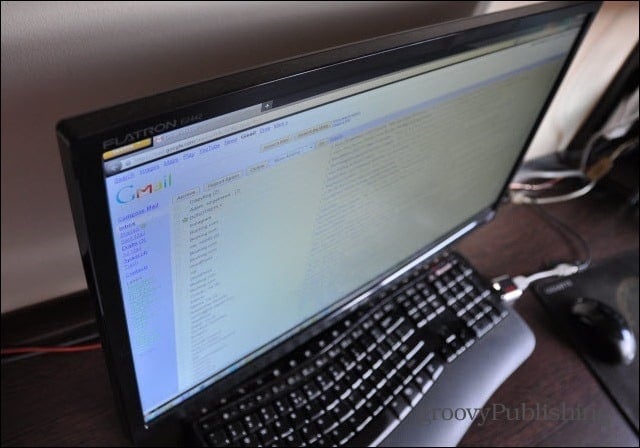
After you’ve done all of these things, you should have a Gmail inbox that looks something like this:
Go Completely Back in Time
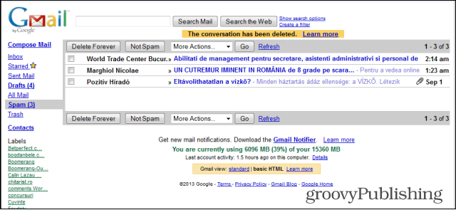
If you want something that looks almost exactly like the old interface, without all the bells and whistles that Gmail has added in later years, there is a solution. Mind you, it makes things more simple from all points of view, but you can always revert to “present day Gmail” if you feel like something’s missing. Gmail’s HTML version, which is designed for when Gmail is loaded through a slow dial up connections. It bears a striking resemblance to what Gmail used to be back in the day. If that’s what you want, bookmark this address: https://mail.google.com/mail/?ui=html
What’s your opinion on the changes Gmail continually makes to your inbox and not allowing you the choice to opt-in? Do you like your Gmail the way it used to be or do you find the new features helpful? I don’t get why they have to fix something that wasn’t broken, in my opinion. But I do have something that’s broken, maybe you can assist? My company’s Help Desk is at a loss. You mentioned the Compact view, I have been defaulted to that view for quite a while now. My problem is that when I have an email that is wider than the viewable area I no longer have the vertical scroll bar at the bottom of the email so I can’t see what’s over on the right side. The only way that I’ve found, on my own (no thanks to the Help Desk) is to switch to Cozy and then right back to Compact. Voila – scroll bar magically appears. I love Groovy Post, I have found some great tips here. As well as everyone I’ve encountered here has been extremely helpful and friendly : ) Thank you once again :-) Unfortunately I’ve got a couple company websites that I use daily and they haven’t joined the 21st century yet and I can only use them in IE. So…I’m stuck with IE for some things. Comment Name * Email *
Δ Save my name and email and send me emails as new comments are made to this post.
